
This time I learnt from my mistakes and didn’t assemble the front and back of the card.
I had roughly designed what I wanted on my tablet, and using the template I had created for my brother’s card, I split it up into sections I could place the Lego figures in.


Yes, Lego. I had discovered while looking for my nephew’s card, that you could get mini figures printed and designed to represent all sorts of characters. Being Sci-fi, horror and comic fans, I knew my partner would love it, and started to find as many as I could that would reference films and characters we both loved.

This meant a few adjustments to the original design, I had to work out how deep the card needed to be so I could get as many figures in as possible, but still have a diorama for them to be in. It ended up being nearly 5 inches deep! (Note, I often use inches as the Cutterpillar Crop is only in inches.)
I first cut out the “5” in black cardstock, then again in silver glitter card using my ScanNCut. This time the back of the card is solid. I realised after my last effort, that although it was pretty cool to have the front and back see-through, ultimately it was wasted as the angel hair stopped you from seeing through it, and most of the time people would only look at it from one side. I also needed a solid backdrop for the dioramas I was about to create.
Using the same template I had created for my tablet to rough out the design, I also made a cityscape in Paint Shop Pro, making sure there were plenty of levels and windows to make sure it was interesting. I imported it back into Canvas Workspace, and adjusted the size to make sure it would fit as well as possible. Considering I had to go through two application to do this, it worked out ok. This was also cut out in black card, and I had to make a couple of extra adjustments to shorten it so it fit. The cutting was great fun— each piece was very delicate and had loads of tiny “windows” cut out, all which needed to be carefully removed from the cutting mat.


As I was going this, I realised the large “5” I had cut out in silver glitter card wasn’t going to work. The idea behind that was to provide some twinkle and shine for the lights I was going to add—yes, lights. I realised that I would have to mask off areas of the background, and it was easier to cut out the cityscapes again in the silver glitter card, this time with no windows. I also cut out the cityscapes in black too, and glued them together to make the buildings as solid as possible. This time I reversed them as the originals were a bit sticky on the back as I has just reglued the mats, and I wanted to avoid that.
The next stage was to create a wall. I wanted to use embossing to create depth on the wall, and had bought some Doeflex to do this. I created the wall in Canvas Workspace from a photo I had. After a lot of picking through it to make sure the wall had both character but would cut correctly without creating tears or weak spots, I was ready to cut. It went far better than I could have imagined, the Doeflex cut easily, and the end result was perfect. The funny thing is that even months after cutting it out, I still find “brick” shaped pieces of Doeflex occasionally, they really went everywhere when I cleaned off the mat!
The I ran it through my die-cutting machine (a Spellbinders Grand Calibur) using the embossing mat. Honestly, I was not prepared for how deep and good the result is. I used Spray M Boss to help the paper fibres relax, which did warp the paper somewhat, but it’s something I will try again with other textures. I then used inks to age and redden the paper (which was grey to start with) to create the wall.


I then cut out the sides of the cards using the ScanNCut so I didn’t have to hand cut all of the triangles again. It worked pretty well, although sometimes the blade skipped for some reason and tore the card. That may be because I was using a thicker card as it was so construction based, or just that I’d worn out the blade!


Now was the time to start constructing the outer edge of the card. I did this much the same as the last card I made, except this time I was more aware of the pitfalls of what could happen. I used the Cutterpillar Crease to get as even an edge as I could down the serrated edge. Each piece was left to dry before the next was added, and I overlapped the pieces to make a strong join. I also made sure it was in just a bit from the edge as I was going to clad the outside. Once I was done, I put a book on top and left it to cure for a few hours.
Once that was done I had to chop down the cityscape again just a bit. I had to add the outer edge first so I could hide the construction of the card behind the other elements, but it made it really fiddly, especially with the lights.
These had to be added early on as they are a part of the piece. These are mini craft lights that can come in strings of many lengths, although you can also chop them down if needed as the wire is not a circuit (check you can do this before chopping however, and these are battery lights—not mains electricity versions. And never do this when switched on!). I chose white lights, as I though they would be more appropriate for the city.
I had to work out how to keep the lights in place. The obvious answer was to staple them, as it was fairly flat and quick. Despite the size of the lights, they have a lot of wire, but I gave up trying to hide them behind the walls of the buildings (impossible as they are mostly windows), and just distributed them as evenly as I could. This was added to the sparkly card layer, which would them be mostly covered by the black card, leaving only a shimmer showing though the windows.

I then used black foam pads to slightly lift the façade of the buildings, and create another level of 3D. This was repeated for the second level of buildings, using up all the lights.


At each stage I placed the figures on the card so I could get an idea of how they would sit, and make sure there was room for the figures. It’s also a great way to see if you’ve missed any parts, or if you have gaps that need filling.


I then looked at getting the basement/alley/interior done (take your pick). This is a simple brick wall which curves over the characters. The idea was it was going to be a sewer, but in the end I’ve left it open to interpretation. I backed the embossed wall onto card, and also trimmed it to fit into the space. I curved it to give me the effect I wanted, but didn’t fit it just yet.
First I had to fit the cityscape, and the power pack for the lights. But to make it worse, first I had to attach the Lego figures to the landscapes! I didn’t want to use glue as that would ruin the figures, and my partner might want to make a display with them later if he doesn’t want to keep the cards. So each one was tied in using fishing wire. I had to make holes though multiple layers of card (avoiding the lights) so I could thread it through and tie it at the back. Then I had to make sure the figures were standing upright.
I also brought the second level of city forwards by a bit so that it created another level. I wish I had done that also with the top level, but that’s the kind of thing you learn by building these things.
Finally I had to make a road for Ghost Rider to go on. I attached it with brads at the bottom of the lower cityscape. I had to then attached Ghost Rider to the road directly, which was really difficult as it meant dragging the cityscapes in and out of the space to try to get him in place so Godzilla can be seen—and after doing it twice poor old Godzilla is still a bit hidden. Still, Ghost rider looks great, so I’m not complaining.

Once they were on, I had to glue on the back of each city skyline and squeeze it into the space that it is tailored to go into—all with a fragile wire connecting the two. I had to make sure they were aligned and the wire was as hidden as possible. To make it neater, I added a back layer of black to cover the triangles holding the sides on, and hiding the wire too. This required another cutting out of the “5” to cut down to fit.
Once they were dried, I glued the battery pack in place at the base of the “5”. I punched a hole through the side to give access to the on/off switch. Although I will cover it with paper I do regret having it so visible at the front, I thought it would make a neater way of covering the back, but I would cut a slot in the back now, and have it on the outside. I also added washers to the base and covered with card to weigh the number down.


Finally, with the help of a couple of blocks, the curved brick wall went in, and the road was connected to the top of the brick wall. I should have left the brick façade until I had connected the road so I could make the join look better.


I wanted to attach Superman and Spiderman as though they were flying.

My first attempt failed, as the card distorted too much, so I added the black cap on the front of the “5”, the one that goes under the shiny card. That supported the front enough so that when I added the two, they did not distort the “5”, although it did make it so much more difficult to attach them. Spiderman has a web shooting from his hand made from braided fishing wire, and both were attached using black cotton ad fishing wire shower up as shiny lines, even when painted black.

I had to add
additional card to the back for superman so I could adjust the way he was
fitted. By twisting it I could get him in the right position, and then glued it
in place.


At this point, I started on the “0”. I left completion of the “5” just to be sure that it was going to work ok.
My original plan was to have a jungle at the base, then a factory, the horror scene, then finally space. I decided to do the jungle, then the horror, as it made a more pleasing appearance.
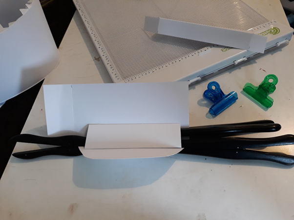
Again, I cut out a solid back and the edges, scoring them as appropriate. The curve of the “0” made this far more difficult to create layers, as each one had to be shaped, and strengthened. In the end I created a simple triangular block at the back of each piece (glued and clipped using Edwardian glove stretchers, of all things), just to give it some rigidity.


After some thought, I lined the “0” with black, I should have made it all with black, I think, as it makes the backdrop fade back.
I also made a hole in the back, and added the battery pack for the lights to the back of the card, where it is hidden more.

The jungle was simple, I cut out a lot of foliage using my ScanNCut, and applied it to the background.

For the horror scene I wanted a “cabin in the woods” type background, and I naturally choose the one from The Evil Dead. I have an Ash figure, but no deadites, so various horror movie characters are standing in. By the way, I’ve mixed a lot of different heroes and anti-heroes with bad guys from all sorts of genres and universes, I suppose I could have stuck to it being accurate, but where’s the fun in that?
I made the cabin by chopping up American Cardstock in tiny slices, colouring them with stamping inks, and making little boards with them. They were stuck directly to the back, I cut two holes for the windows so I could light it from behind. I added transparency to the windows, and then boarded them up with more “wood”. The roof (which is just temporary in the photos—it can go on last) was a triangle of paper with more strips of paper added. The two columns are wood skewers with a layer of paper around them. I also put two lights together and covered them with red transparency in the hope it would look like two red eyes… it almost works.


For the Terminator, RoboCop, the Saw puppet (Billy) and Terminator skeleton, I wanted an industrial look. Rather than actually build anything, I cut out loads of shapes of “machines” and “claws” in different shades of metal and grey, and layered them up. Because I had already stuck the cabin layer down, I was forced to add them into to the background. But that was ok, although ideally Billy should have been fixed in two places by the wheels like Ghost Rider. Some of them face forwards because I didn’t want the detail to be lost.


Finally, the space level. I had Luke and Darth Vader (my personal favourite from that franchise), as well as a huge Xenomorph (perhaps my favourite model—although V and skeleton Terminator are also up there with the best!) from Alien, and of course a badly-shooting Stormtrooper. As the alien is so HUGE (with that tail!) she took up a lot of the space. So I had her attacking the Stormtrooper while Luke and Vader fight.

To make this as simple as possible, I created a star field with the lights, applying them to my favourite glitter card, and added a sheet of black over the top. I punched holes into it with a leather punch, gluing it on with Pinflair Glue Gel.


I created a simple arch of silver to give the idea that they are on a ship, nothing fancy. I be honest, you can barely see any of it!

They were all tied into the back of the card. I speared myself about three times punching holes, and it took forever to thread the fishing wire through the holes. In the end I threaded fishing wire though from the back, and dragged the wire attached to the figures through, holding it with clips. It was horrible work, there was no space, and I couldn’t see what I was doing (which is why Luke is floating slightly).


After a couple of days of not wanting to work on the cards, I finally did the outer layer.
The body went on first, this time I used Pinflair Glue Gel as it doesn’t upset the card or mark it. I used at least two whole tubes on this one card!


The I put on the front, with the acetate, after making sure the figures were ok, and the lights still worked. I had to re-cut both fronts because they were too small, next time I won’t cut them at all until the end. The sides had distorted the shape of each number slightly, mostly the “0”, where the cabin layer had pushed the sides out, but also from how I had originally stuck on the edges. I have an idea about that, see later.


I was really at the end of my energy for this card, and missed some glue spots. I realised I should have coloured the edges of the black and white card where it shows at the joins before sticking on any of the cladding—something to think about next time.
But overall, I’m happy. The “5” is too dark, so some of the figures are lost, but the “0” just looks spectacular.


Alternative way to fix the sides
I was watching Create and Craft (not a sponsor), and I saw Mel Heaton doing box with sides similar to my numbers.
She used the tabs at the edge of the side in a different way to me, instead of trying to keep them inside the base, she put them around the edge.
Two tabs below, one above, and so on around the card.


I had been trying to preserve a small edge to recess the side cladding in, and failing, so this appeals to me. It might help keep the shape better, and although I will have to cut the shape six times (one for the base, another to cover the tabs in the base, a third for the first layer of opening, and the cladding front and back, and the acetate), I can see that the shape may be more accurate, and easier to control. There’s less risk of stretching the sides and distorting it, and the front layer that helps draw it into shape could be done the same way. The front and back can then be cut a few millimetres bigger to take the side cladding.
Comments
Post a Comment